Measures and Control Charts
Control charts re simple to configure using a Measure Template, and then the Center Line, Upper Control Limit and Lower Control Limit are automatically plotted.
- Percentage (P chart)
- Count (C Chart)
- Rate (U chart)
- Cases between Events (G chart)
- Time between Cases (T chart)
- Individual (I chart)
- Xbar and S chart
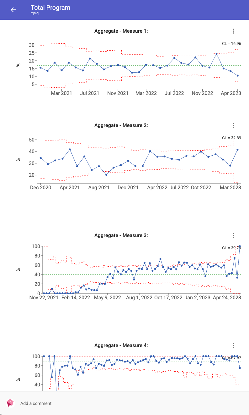
These can be set for a frequency of Daily, Weekly, Fortnightly, Monthly or No Set Timing.
A collection of measures can also automatically roll up the values into a single Aggregate measure.
The calculations for Measures are based on the book The Health Care Data Guide - Learning from Data for Improvement, Provost & Murray.